Insights Studio - User Guide
Insights Studio - User Guide

What is Insights Studio?
Insights Studio helps you extract meaningful business insights from your agent and projection datasets without spreadsheets or complex analytics tools.
In a few clicks, you can create dashboards, explore your dataset, and build visual widgets to track volume, trends, category splits, and performance over time.
Who is this for?
Business owners and managers who want quick answers from agent data.
Operations teams who track daily activity and outcomes.
Any non-technical user who needs charts and dashboards in minutes.
What you can do
Create dashboards from agent or projection datasets.
Build widgets: charts, pivot tables, KPI cards, and text blocks.
View raw data in the Data Explorer.
Group by time (Hour, Day, Week, Month).
Choose metrics (Count, Sum, Average, Min/Max, etc.).
Add filters and dropdown filters to focus on specific segments.
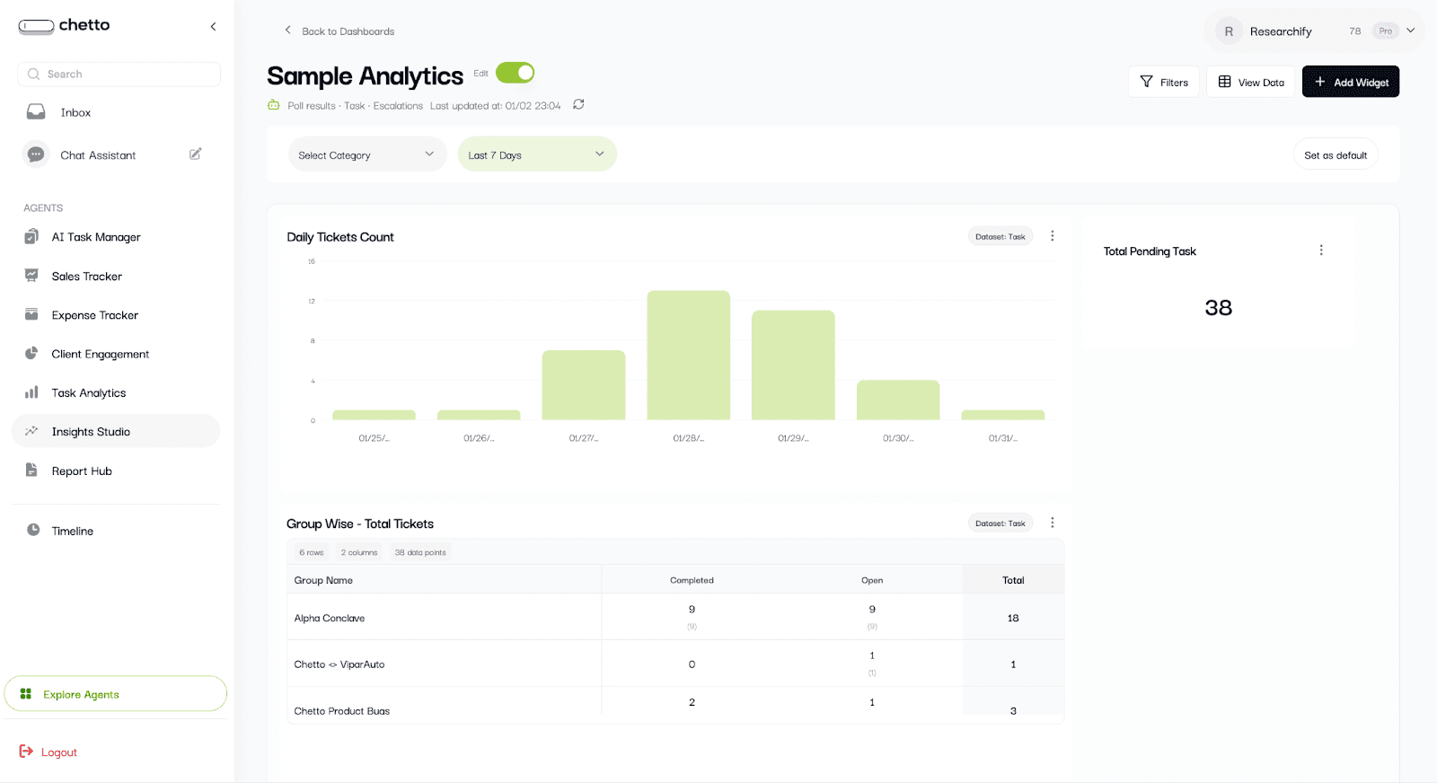
1. Dashboards
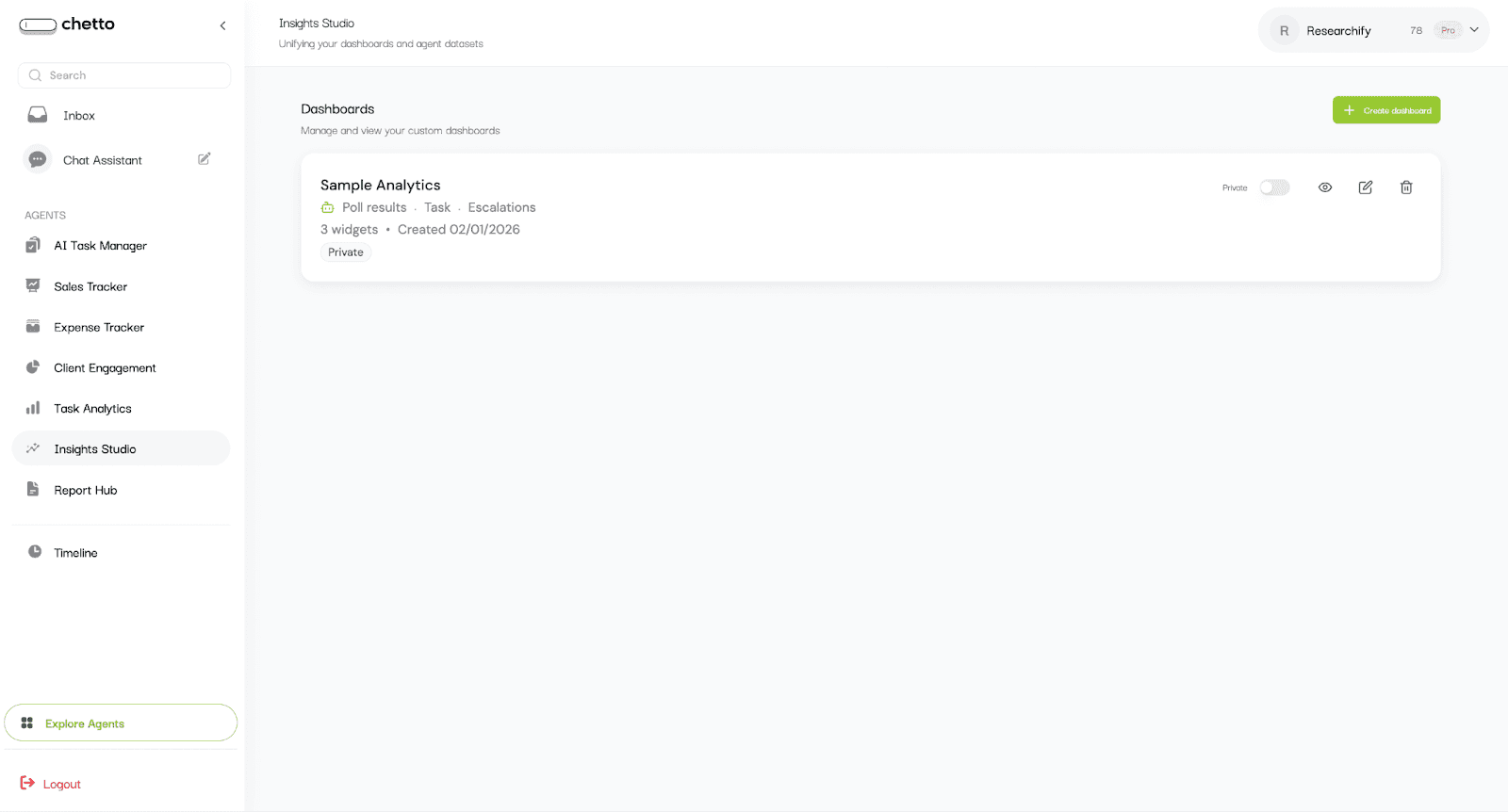
From the left sidebar, open Insights Studio. You will see the dashboard list with all existing dashboards.
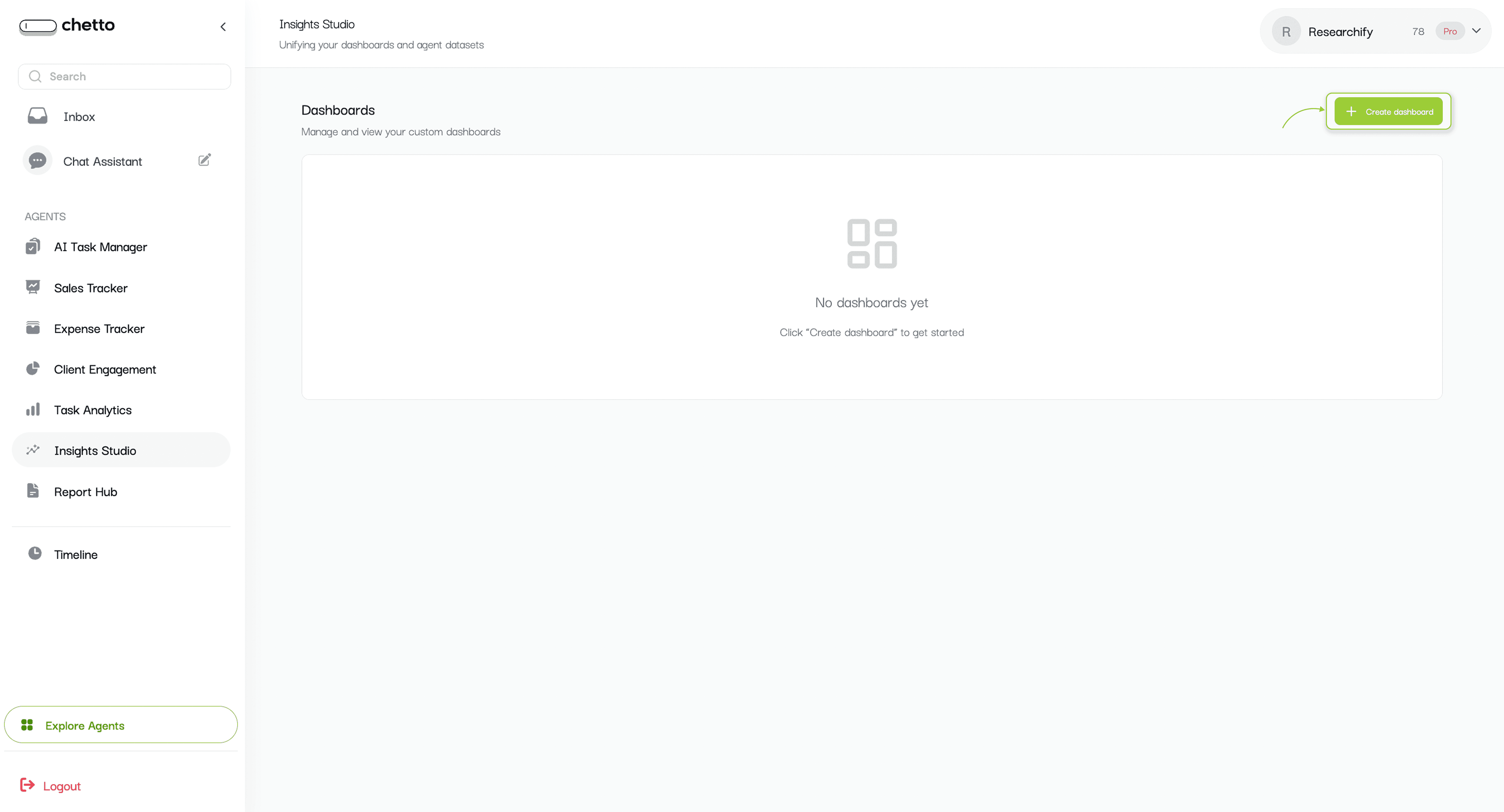
Each dashboard card includes (if it exists):
Dashboard name and data source.
Widget count and created date.
Visibility status (Public or Private).
Quick actions: View, Edit, Delete, and visibility toggle.
To start: Click the "Create dashboard" button.
2. Create a dashboard (choose data sources)
After you click "Create dashboard", a dialog will open.
Enter a dashboard name (example: Sample Analytics).
Select one or more data sources (Click on select all):
Projection datasets (Poll results, Task, Escalations)
Custom Agents (your agent datasets).
Click "Create Dashboard".
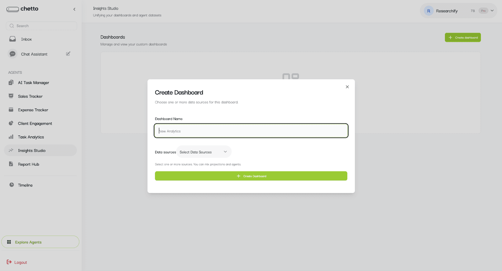
Tip: You can combine multiple datasets in one dashboard, which makes comparisons easier.
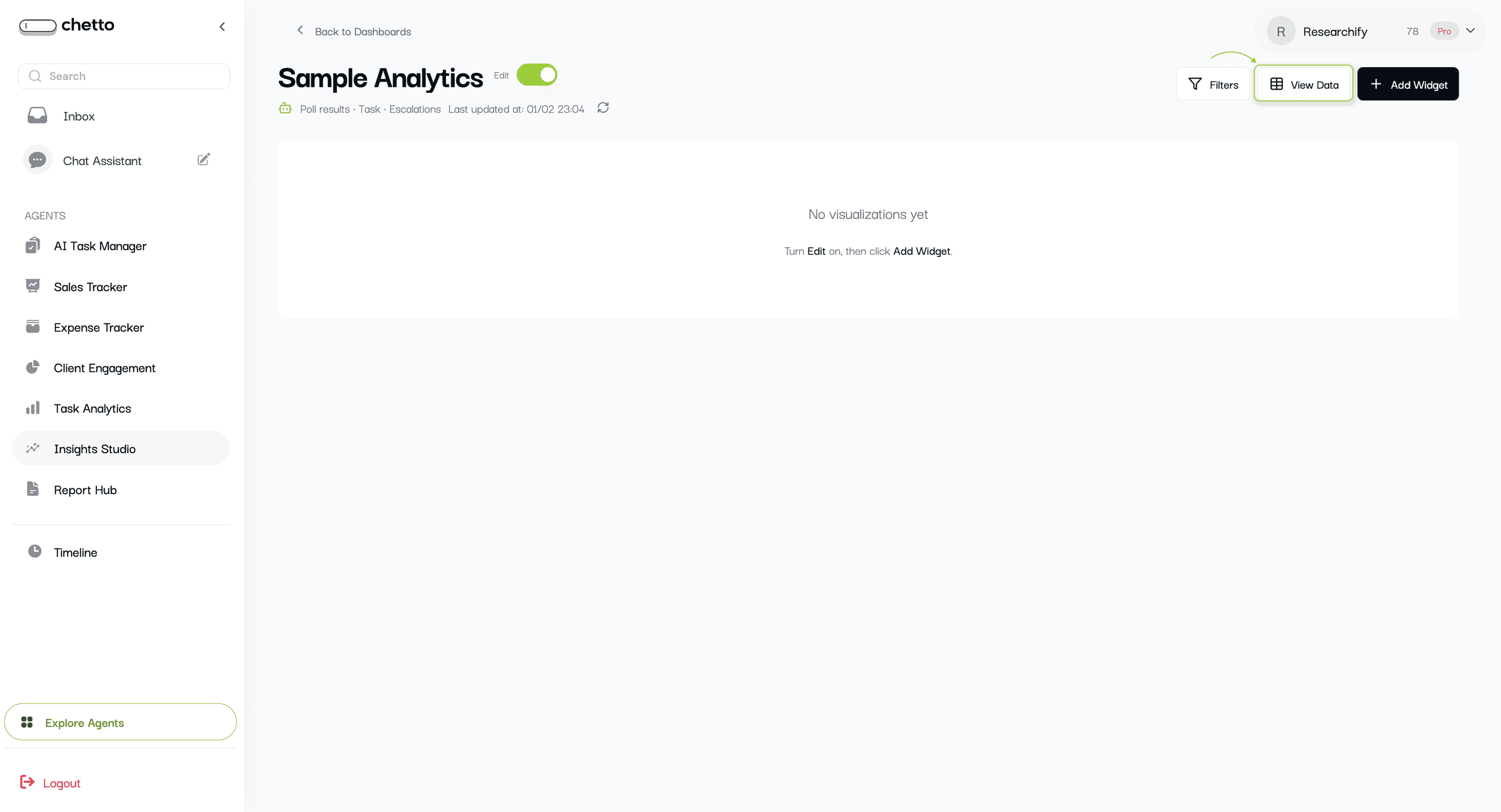
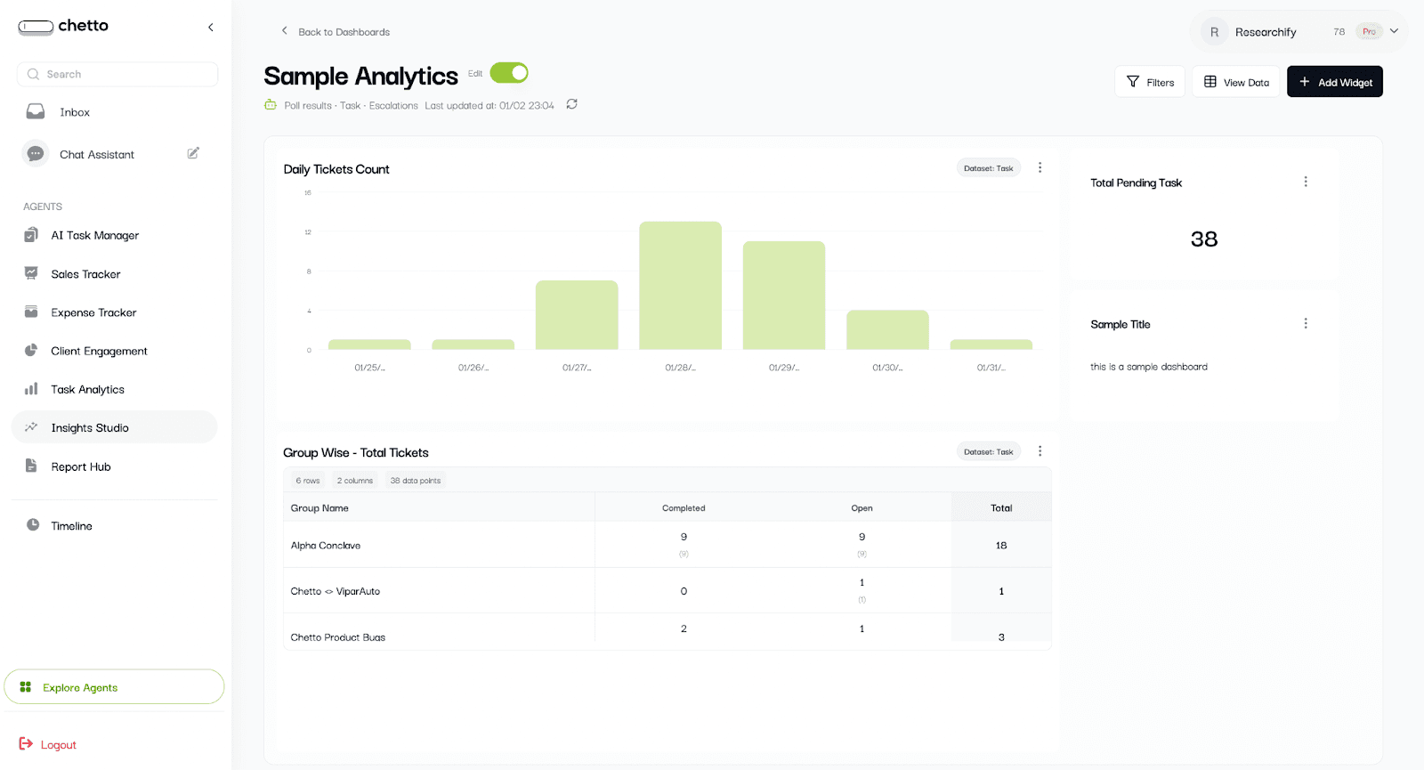
The dashboard opens with an edit dashboard.
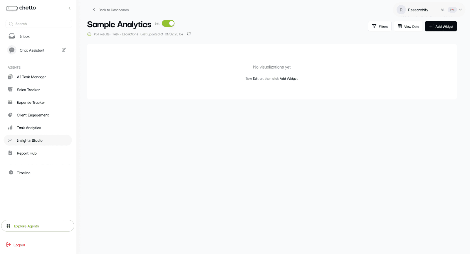
Highlight - view data
3. Explore your data in View Data
Before building charts, it helps to understand which fields are available. Click "View Data" to open the Data Explorer.
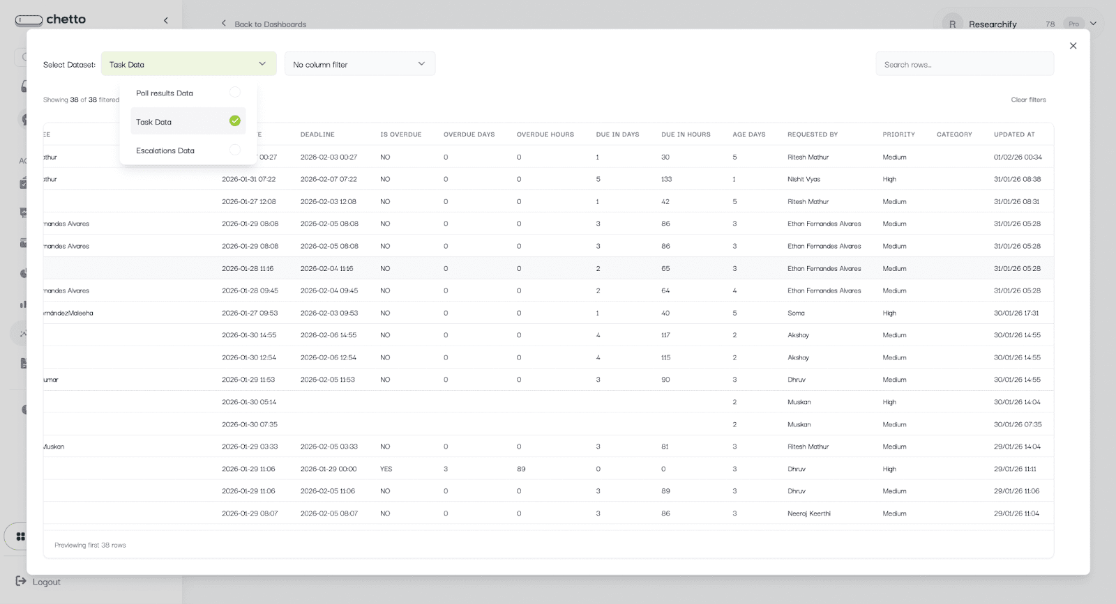
What you can do here:
Click on select data to see different datasets
Search across rows.
Select any column name you want to filter and select its respective value.
Sort by any column (ascending or descending).
Let’s create dashboard
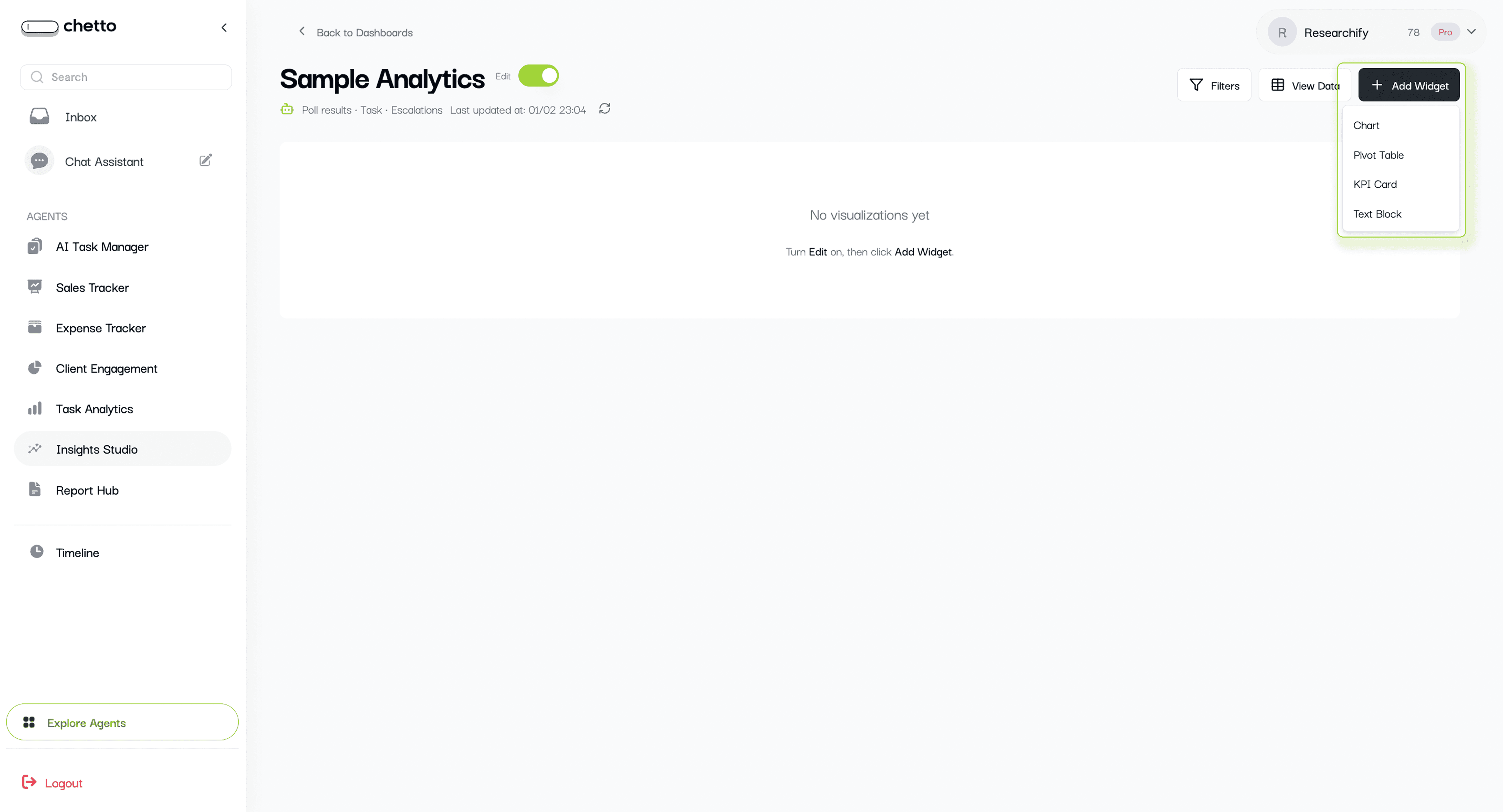
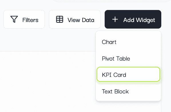
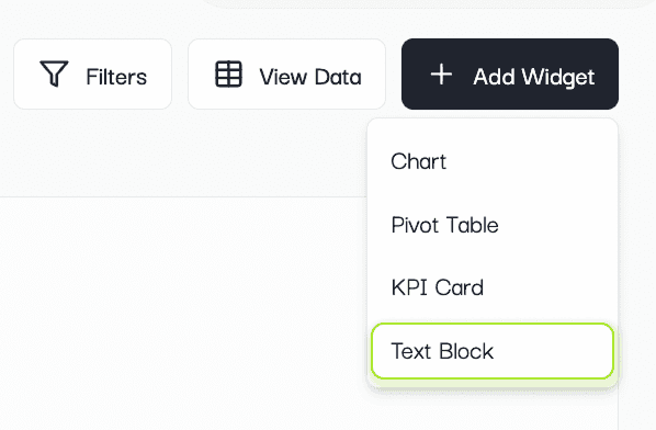
4. Add widgets to your dashboard
Available only when you’re in Edit mode.
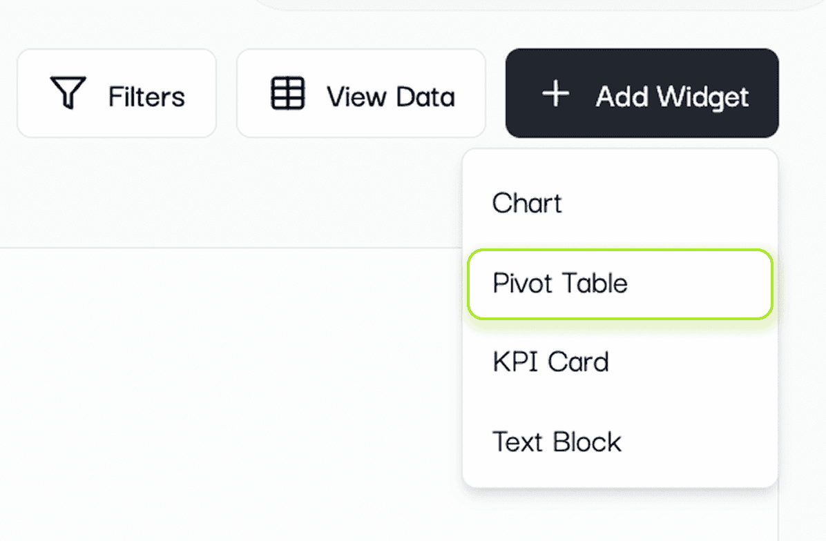
Click "Add Widget" to choose what you want to create:
Chart
Pivot Table
KPI Card
Text Block
4.1 Create a chart
Select "Chart" to open the chart builder.
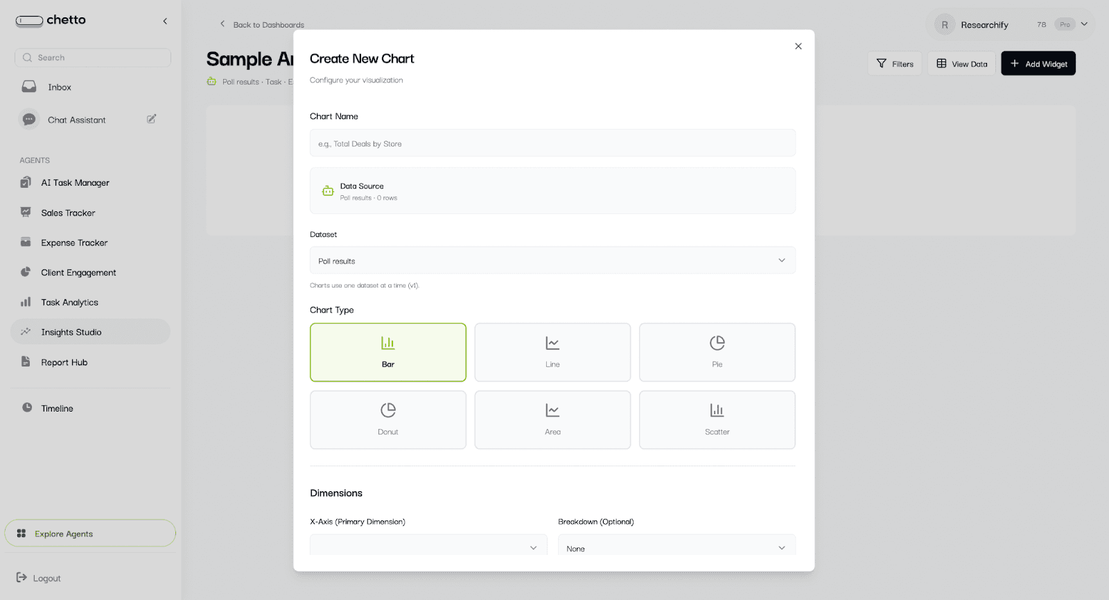
The chart builder works in this order:
Give the chart a name.
Select the dataset (if multiple are available).
Choose a chart type.
Select Dimensions (X-axis and optional breakdown).
Optionally group by time.
Choose a Metric (count or aggregation).
Add Filters and Display options.
Click "Create Chart" (or "Update Chart").
Example ideas:
Orders by store: X-axis = store, Metric = count (or sum of revenue).
Purpose of visit by project: X-axis = project_name, Breakdown = purpose_of_visit.
Daily visits: X-axis = date or created_at, Group by Time Period = Day, Metric = count.
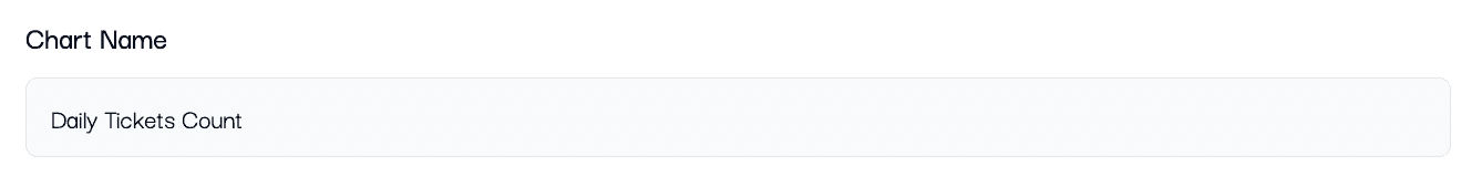
4.1.1 Give the chart a name.
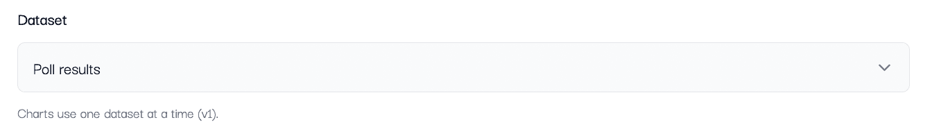
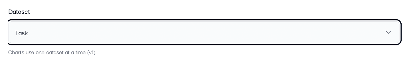
4.1.2. Select the required dataset (if multiple are available).
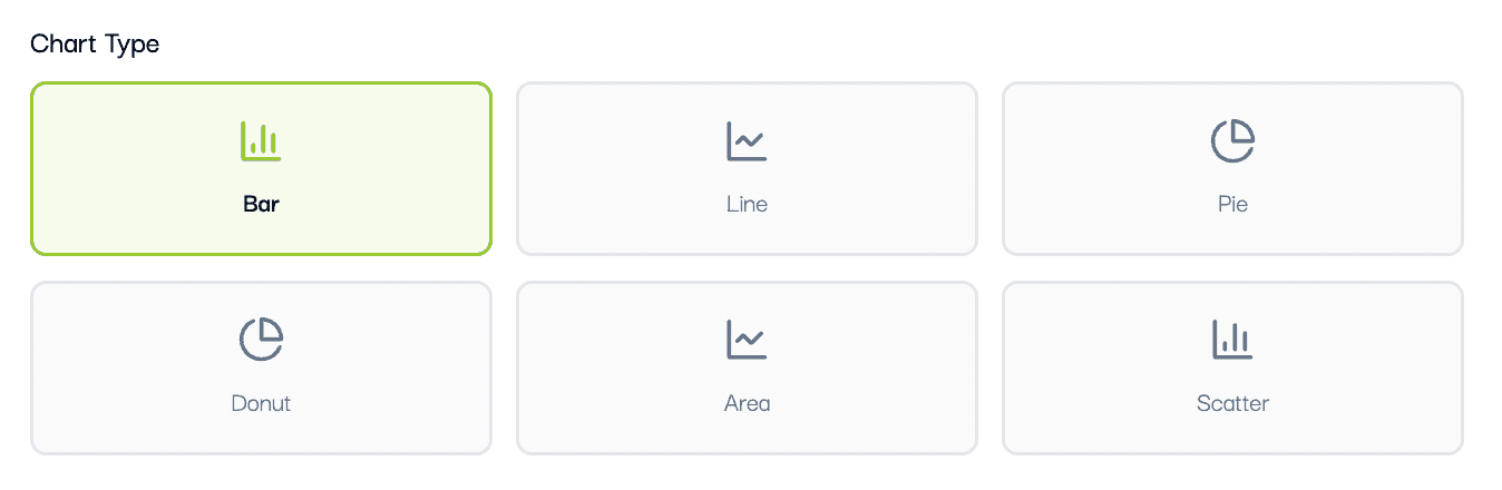
4.1.3. Choose a chart type
Pick a chart type based on what you want to understand:
Bar: Compare categories (example: visits by project, expenses by category).
Line or Area: Show trends over time (example: daily orders).
Pie or Donut: Show share or distribution (example: purpose of visit).
Scatter: Compare two numerical fields (example: discount percent vs effective price).
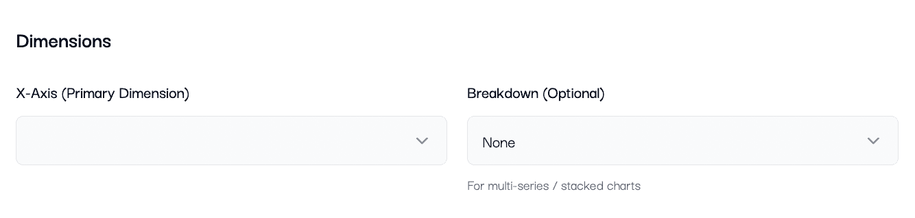
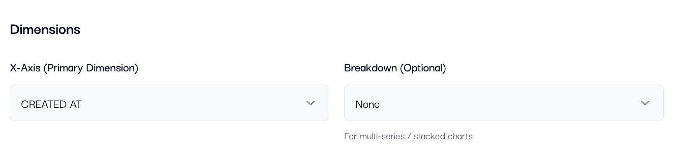
4.1.4. Set Dimensions (X-axis and Breakdown)
Dimensions decide what your chart is grouped by.
X-Axis (Primary Dimension): The main field you want to analyze.
Breakdown (Optional): Splits each X-axis item into multiple series (useful for comparisons).
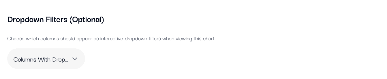
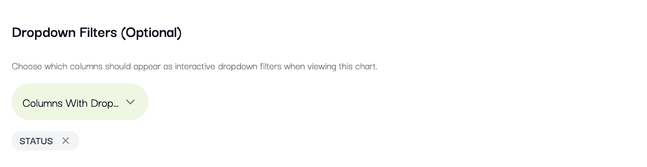
4.1.5. Dropdown filter
Add the dropdown filter if required in the chart by selecting the
4.1.6. Use "Group by Time Period" for trends
Group by Time Period is optional. Use it when you want to group results by time.
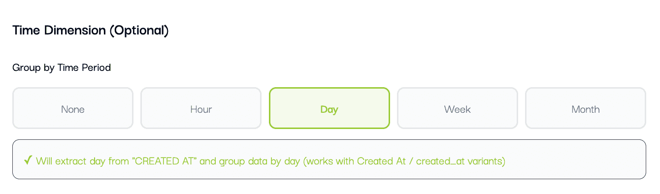
Options:
None: No time grouping (best for category comparisons).
Hour: Results grouped into hours (9 AM, 10 AM, etc.).
Day: Results grouped day-by-day.
Week: Results grouped week-by-week.
Month: Results grouped month-by-month.
Note: For time grouping to work, your selected X-axis should be a date or time field (example: created_at, date, entry_time).
4.1.7. Choose a Metric (what to calculate)
Metrics decide what number the ch
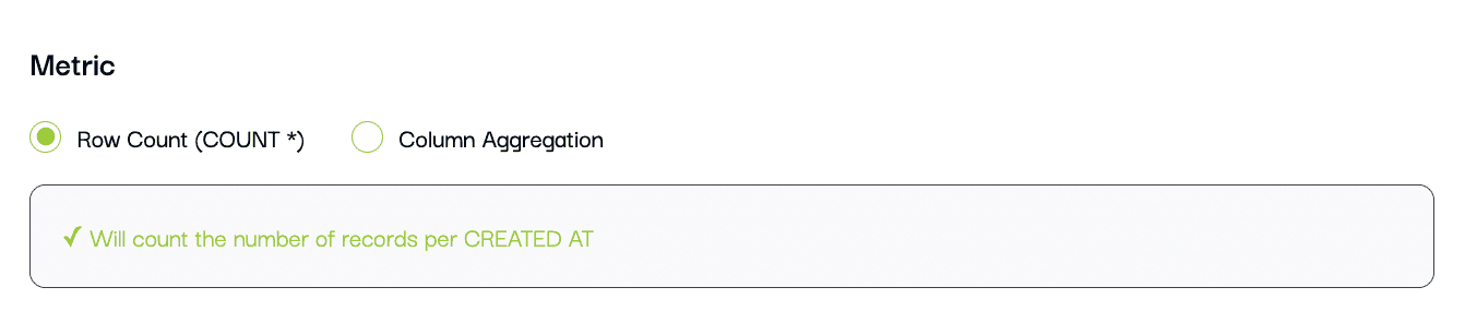
art should show for each group.
*Row Count (COUNT ): Counts how many records exist in each group. This is the most common choice.
Column Aggregation: Calculates a value using a selected column and an aggregation function (sum, average, minimum, maximum, etc.).
When to use which:
Use Row Count for "how many" (visits, orders, records).
Use Column Aggregation for "how much" (total revenue, average discount, max bill amount).
4.1.8. Configure display options
Use display settings to control how your chart appears:
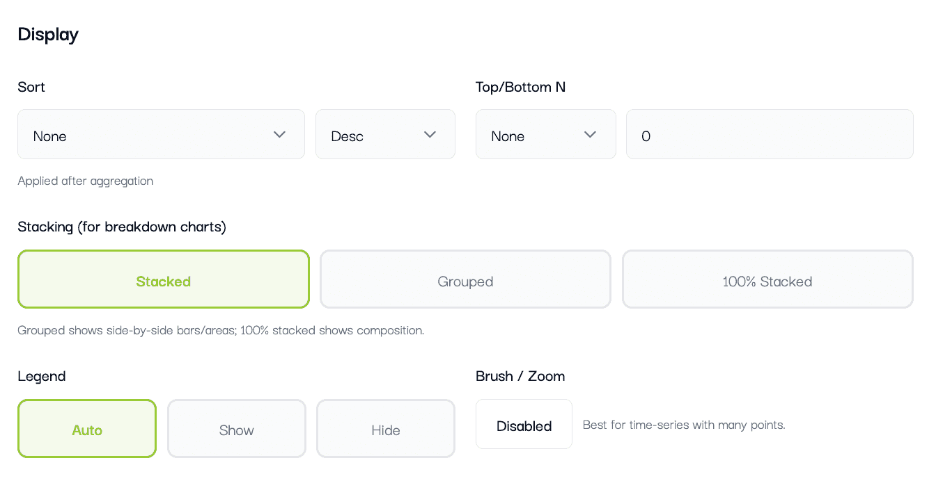
Sort by Metric or Dimension (ascending or descending).
Show Top or Bottom N categories, with optional "Other".
Choose Stacking: Stacked, Grouped, or 100% Stacked (bar/area).
Toggle Legend visibility.
Enable or disable Brush (zoom) for time series.
4.1.9. Add Filters and Dashboard dropdown filters
Filters narrow down your data so the chart answers a more specific question.
Example: Show only one project, only one store, or only records with discount_percent > 0.
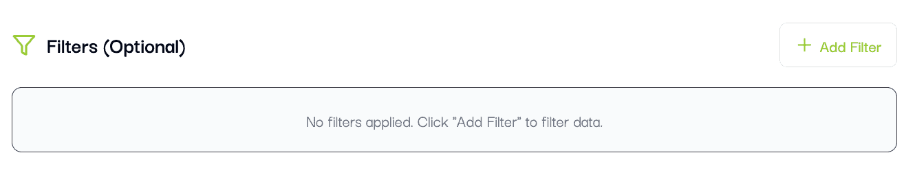
You can also configure Dropdown Filters. These appear below the chart title on the dashboard so viewers can filter without editing.
Tip: Start without filters. Once the basic chart looks right, add filters step-by-step.
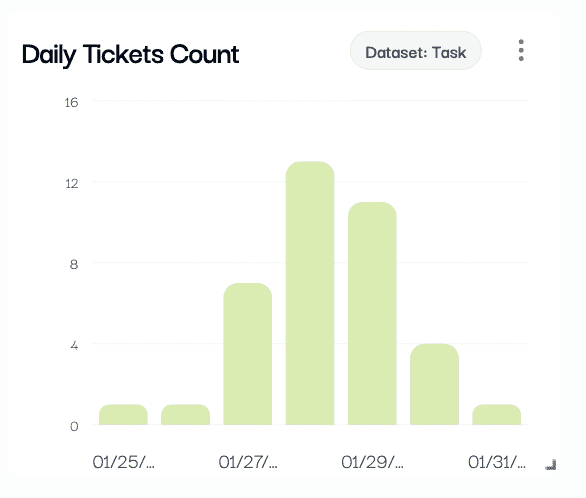
NOW CLICK ON CREATE CHARTS
Your first chart is created.
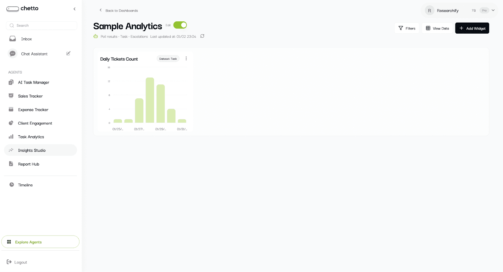
Now, lets resize it
Click in the corner and drag it to re-size it
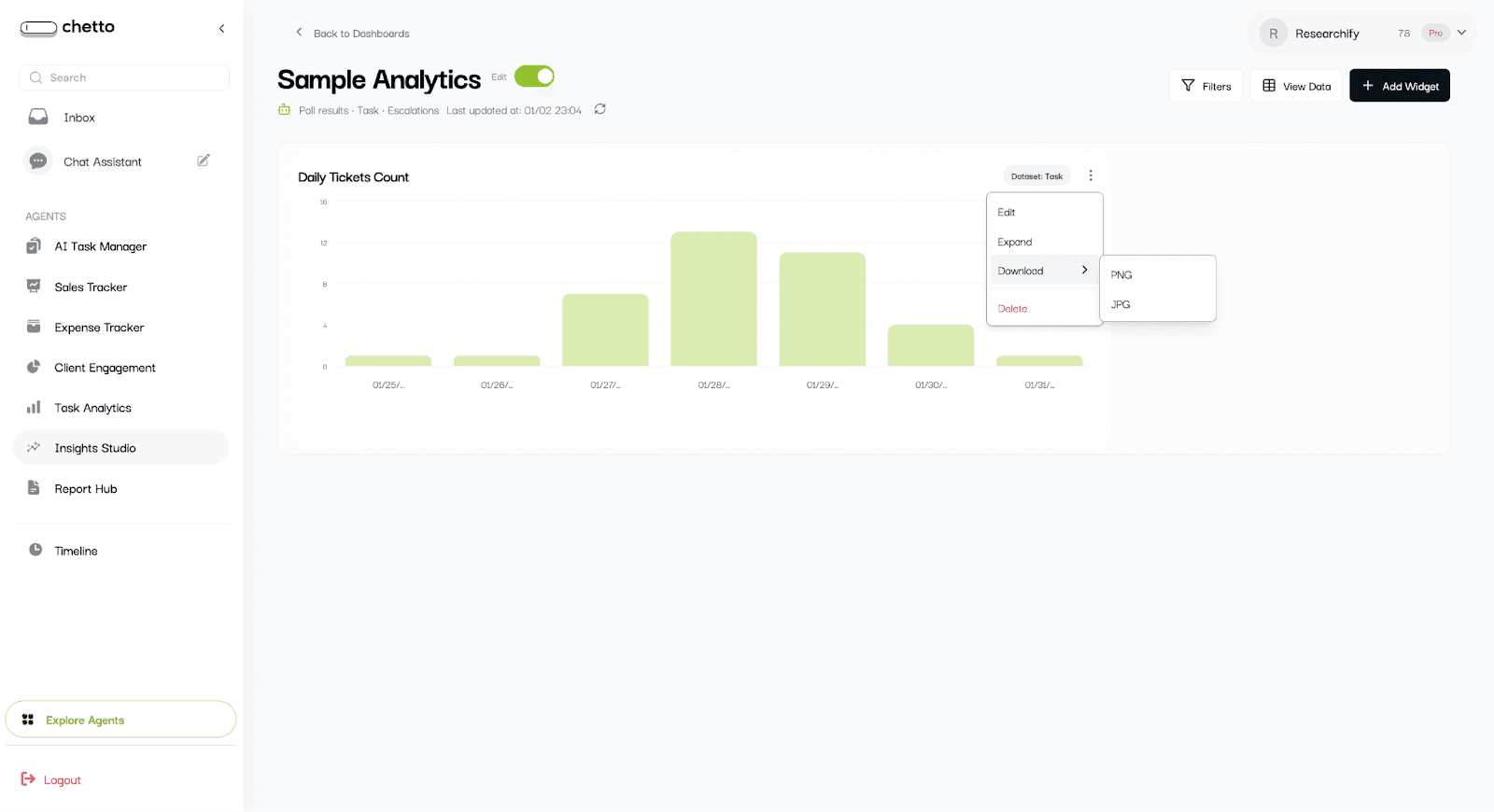
Other options on the chart:
Edit : For any changes/edits
Expand: To get larger expanded view
Download: To get the JPG or PNG file of the chart
Delete: To remove the widget from dashboard
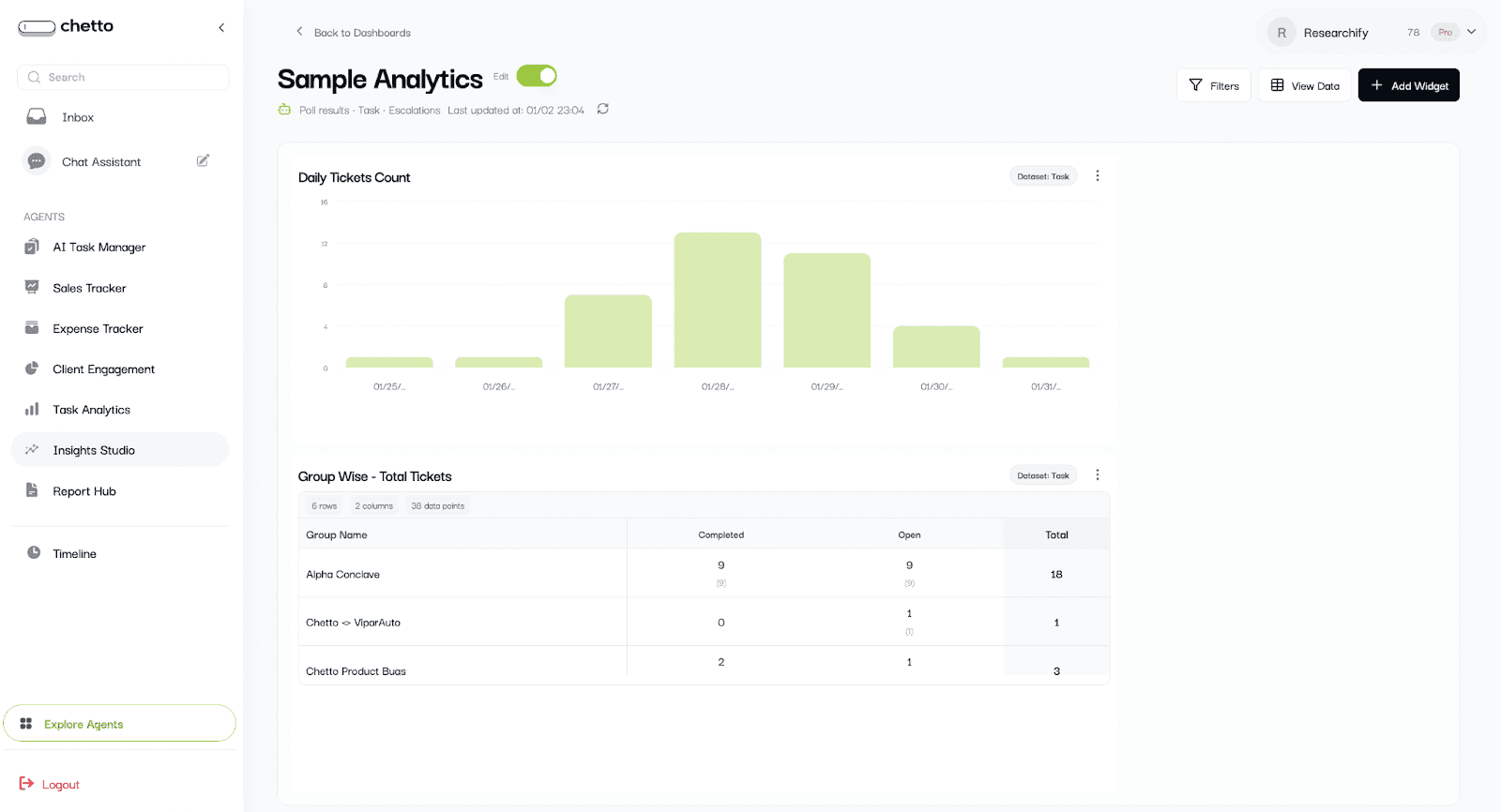
4.2 PIVOT TABLE
Create the pivot table
What you configure:
Pivot Name.
Dataset (if multiple are available).
Rows (primary grouping).
Columns (secondary grouping).
Values (metric and aggregation).
Optional filters to narrow the data.
Use pivots when you need a cross-tab view like “Store by Month” or “Project by Status”.
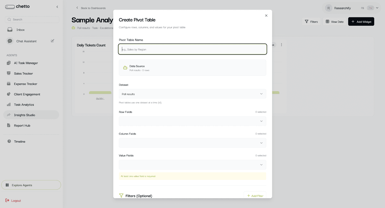
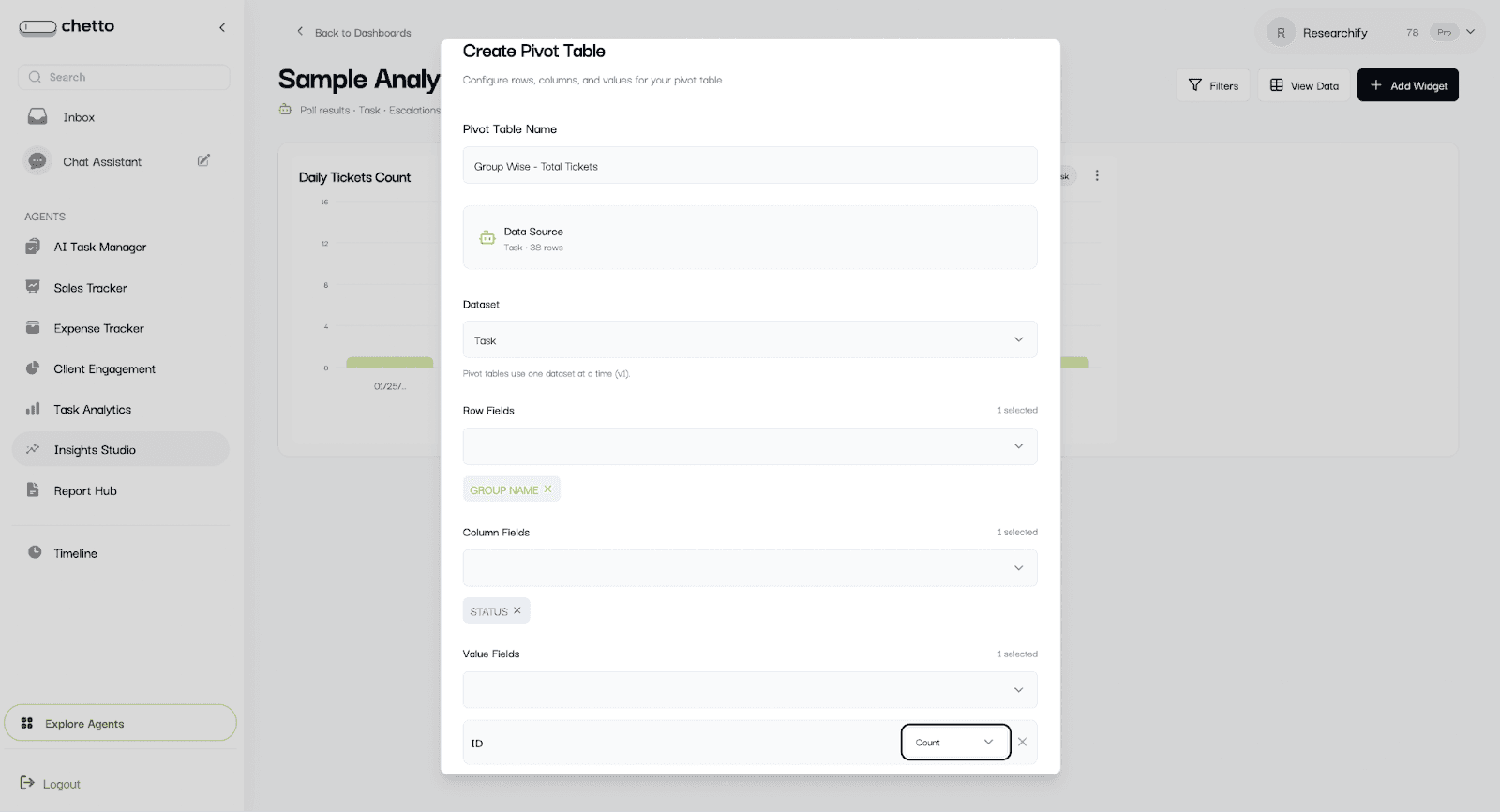
Fill above informations and create pivot table
4.3 Create a KPI card
Select "KPI Card" to show a single headline metric.
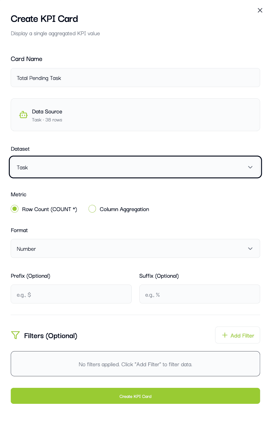
What you configure:
Card Name.
Dataset (if multiple are available).
Metric: Row Count or Column Aggregation.
Optional filters.
KPI cards are best for totals, averages, and one-number summaries.
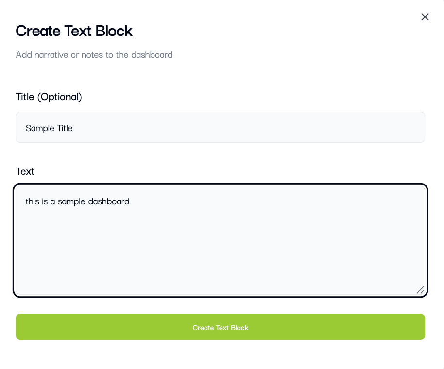
6.10 Create a text block
Select "Text Block" to add notes, context, or explanations.
5. Use the dashboard in view mode
Return to view mode to share insights and interact with widgets. Switch edit toggle to OFF.
View mode:
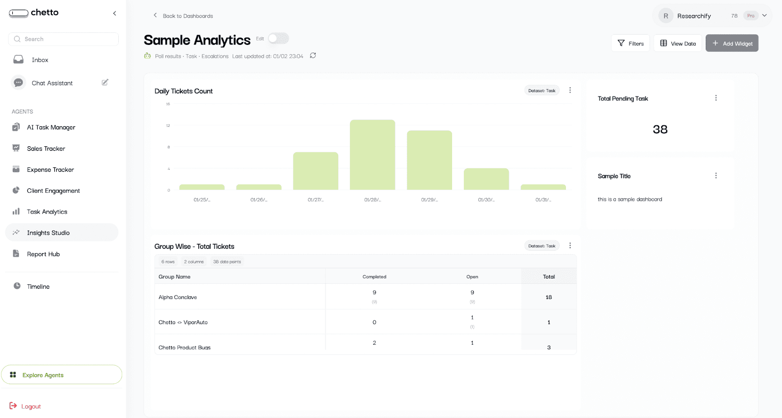
In view mode you can:
Apply category filters and choose a custom date range.
Open "View All Data" to see the dataset table.
Expand a widget to full screen.
Download charts (PNG/JPG) or pivots (CSV/XLSX).
Use dropdown filters set on charts.
6. Use filters and date ranges
Filters apply to all widgets in the dashboard.
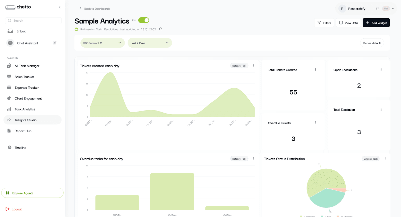
Available filters:
Category or groups: Multi-select options.
Date range:
Today, Yesterday, Last 7/15/30 days.
Custom date range picker.
Tip: Use "Set as default" to save the filter state for this dashboard.
Click on back to dashboard to see all the dashboards

Blog written by
Somsunder S
AI Engineer
Somasunder S is an AI engineer focused on building intelligent systems that transform chaotic real-world data—especially conversations—into structured insights and automated decisions. His work centers on designing practical AI solutions that bridge unstructured communication and actionable workflows.
What is Insights Studio?
Insights Studio helps you extract meaningful business insights from your agent and projection datasets without spreadsheets or complex analytics tools.
In a few clicks, you can create dashboards, explore your dataset, and build visual widgets to track volume, trends, category splits, and performance over time.
Who is this for?
Business owners and managers who want quick answers from agent data.
Operations teams who track daily activity and outcomes.
Any non-technical user who needs charts and dashboards in minutes.
What you can do
Create dashboards from agent or projection datasets.
Build widgets: charts, pivot tables, KPI cards, and text blocks.
View raw data in the Data Explorer.
Group by time (Hour, Day, Week, Month).
Choose metrics (Count, Sum, Average, Min/Max, etc.).
Add filters and dropdown filters to focus on specific segments.
1. Dashboards
From the left sidebar, open Insights Studio. You will see the dashboard list with all existing dashboards.
Each dashboard card includes (if it exists):
Dashboard name and data source.
Widget count and created date.
Visibility status (Public or Private).
Quick actions: View, Edit, Delete, and visibility toggle.
To start: Click the "Create dashboard" button.
2. Create a dashboard (choose data sources)
After you click "Create dashboard", a dialog will open.
Enter a dashboard name (example: Sample Analytics).
Select one or more data sources (Click on select all):
Projection datasets (Poll results, Task, Escalations)
Custom Agents (your agent datasets).
Click "Create Dashboard".
Tip: You can combine multiple datasets in one dashboard, which makes comparisons easier.
The dashboard opens with an edit dashboard.
Highlight - view data
3. Explore your data in View Data
Before building charts, it helps to understand which fields are available. Click "View Data" to open the Data Explorer.
What you can do here:
Click on select data to see different datasets
Search across rows.
Select any column name you want to filter and select its respective value.
Sort by any column (ascending or descending).
Let’s create dashboard
4. Add widgets to your dashboard
Available only when you’re in Edit mode.
Click "Add Widget" to choose what you want to create:
Chart
Pivot Table
KPI Card
Text Block
4.1 Create a chart
Select "Chart" to open the chart builder.
The chart builder works in this order:
Give the chart a name.
Select the dataset (if multiple are available).
Choose a chart type.
Select Dimensions (X-axis and optional breakdown).
Optionally group by time.
Choose a Metric (count or aggregation).
Add Filters and Display options.
Click "Create Chart" (or "Update Chart").
Example ideas:
Orders by store: X-axis = store, Metric = count (or sum of revenue).
Purpose of visit by project: X-axis = project_name, Breakdown = purpose_of_visit.
Daily visits: X-axis = date or created_at, Group by Time Period = Day, Metric = count.
4.1.1 Give the chart a name.
4.1.2. Select the required dataset (if multiple are available).
4.1.3. Choose a chart type
Pick a chart type based on what you want to understand:
Bar: Compare categories (example: visits by project, expenses by category).
Line or Area: Show trends over time (example: daily orders).
Pie or Donut: Show share or distribution (example: purpose of visit).
Scatter: Compare two numerical fields (example: discount percent vs effective price).
4.1.4. Set Dimensions (X-axis and Breakdown)
Dimensions decide what your chart is grouped by.
X-Axis (Primary Dimension): The main field you want to analyze.
Breakdown (Optional): Splits each X-axis item into multiple series (useful for comparisons).
4.1.5. Dropdown filter
Add the dropdown filter if required in the chart by selecting the
4.1.6. Use "Group by Time Period" for trends
Group by Time Period is optional. Use it when you want to group results by time.
Options:
None: No time grouping (best for category comparisons).
Hour: Results grouped into hours (9 AM, 10 AM, etc.).
Day: Results grouped day-by-day.
Week: Results grouped week-by-week.
Month: Results grouped month-by-month.
Note: For time grouping to work, your selected X-axis should be a date or time field (example: created_at, date, entry_time).
4.1.7. Choose a Metric (what to calculate)
Metrics decide what number the ch
art should show for each group.
*Row Count (COUNT ): Counts how many records exist in each group. This is the most common choice.
Column Aggregation: Calculates a value using a selected column and an aggregation function (sum, average, minimum, maximum, etc.).
When to use which:
Use Row Count for "how many" (visits, orders, records).
Use Column Aggregation for "how much" (total revenue, average discount, max bill amount).
4.1.8. Configure display options
Use display settings to control how your chart appears:
Sort by Metric or Dimension (ascending or descending).
Show Top or Bottom N categories, with optional "Other".
Choose Stacking: Stacked, Grouped, or 100% Stacked (bar/area).
Toggle Legend visibility.
Enable or disable Brush (zoom) for time series.
4.1.9. Add Filters and Dashboard dropdown filters
Filters narrow down your data so the chart answers a more specific question.
Example: Show only one project, only one store, or only records with discount_percent > 0.
You can also configure Dropdown Filters. These appear below the chart title on the dashboard so viewers can filter without editing.
Tip: Start without filters. Once the basic chart looks right, add filters step-by-step.
NOW CLICK ON CREATE CHARTS
Your first chart is created.
Now, lets resize it
Click in the corner and drag it to re-size it
Other options on the chart:
Edit : For any changes/edits
Expand: To get larger expanded view
Download: To get the JPG or PNG file of the chart
Delete: To remove the widget from dashboard
4.2 PIVOT TABLE
Create the pivot table
What you configure:
Pivot Name.
Dataset (if multiple are available).
Rows (primary grouping).
Columns (secondary grouping).
Values (metric and aggregation).
Optional filters to narrow the data.
Use pivots when you need a cross-tab view like “Store by Month” or “Project by Status”.
Fill above informations and create pivot table
4.3 Create a KPI card
Select "KPI Card" to show a single headline metric.
What you configure:
Card Name.
Dataset (if multiple are available).
Metric: Row Count or Column Aggregation.
Optional filters.
KPI cards are best for totals, averages, and one-number summaries.
6.10 Create a text block
Select "Text Block" to add notes, context, or explanations.
5. Use the dashboard in view mode
Return to view mode to share insights and interact with widgets. Switch edit toggle to OFF.
View mode:
In view mode you can:
Apply category filters and choose a custom date range.
Open "View All Data" to see the dataset table.
Expand a widget to full screen.
Download charts (PNG/JPG) or pivots (CSV/XLSX).
Use dropdown filters set on charts.
6. Use filters and date ranges
Filters apply to all widgets in the dashboard.
Available filters:
Category or groups: Multi-select options.
Date range:
Today, Yesterday, Last 7/15/30 days.
Custom date range picker.
Tip: Use "Set as default" to save the filter state for this dashboard.
Click on back to dashboard to see all the dashboards
Blog written by
Somsunder S
AI Engineer
Somasunder S is an AI engineer focused on building intelligent systems that transform chaotic real-world data—especially conversations—into structured insights and automated decisions. His work centers on designing practical AI solutions that bridge unstructured communication and actionable workflows.